UX Booking Feature
This project explores how a redesigned booking system can improve the customer experience for a local optical company. The focus is on making it easier and more intuitive for users to schedule eye exams online. The work was carried out for Blickpunkten, a trusted family-run business with three stores in Gothenburg. As UX lead, I collaborated with two developers and the head of marketing to redesign the booking feature based on user interviews and interface testing. The result is a prototype that streamlines the booking flow while preserving the familiar tone of the brand.
My Role
I conducted interviews, ran early usability tests, and guided the overall user experience design. Working closely with two developers and the head of marketing, I led the creation of archetypes, wireframes, and user flows. I focused on aligning the digital interface with the brand’s trusted in-store experience, prioritizing clarity, accessibility, and ease of use, especially for senior users and those with poor eyesight.
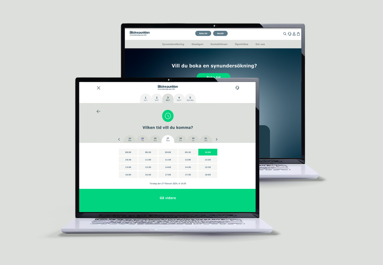
The re-designed booking feature simplifies and personalizes the appointment flow while staying true to Blickpunkten’s brand identity. Usability tests led to concrete improvements, such as removing the “Next” button and using clear, functional language. The final prototype creates a calm, trustworthy, and user-friendly experience that supports both new and returning customers, particularly older users who value predictability.
Usability testing
Early in the process we took the opportunity to make a simple usability test with 5 customers to see if I could find any clues on specific pain points in the current system. The method I used was an in-person “ think aloud” test.
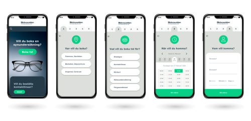
Archetypes and User Flow
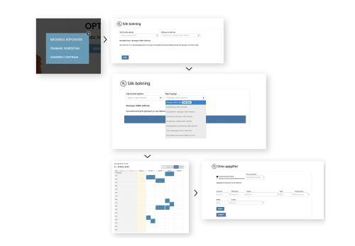
We defined two archetypes, the primary , Kim, senior user, seeking stability and sense of belonging and, secondary, Robin, the efficient parent. We created a stepper to break down the input needed from the customers into 4 main questions. Where, What, When and Who.
Where, What, When, Who
Mooringo’s visual identity combines a nautical foundation with a playful and youthful twist. While the base uses familiar marine tones like blue, the addition of fresh greens, coral pinks, and sunny yellows creates an open, friendly feeling that sets the brand apart from more traditional harbor aesthetics. The color palette reflects a modern take on boating—welcoming a new generation of boaters while remaining functional and readable in outdoor environments. The design is approachable, energetic, and easy to recognize—just like the app’s purpose
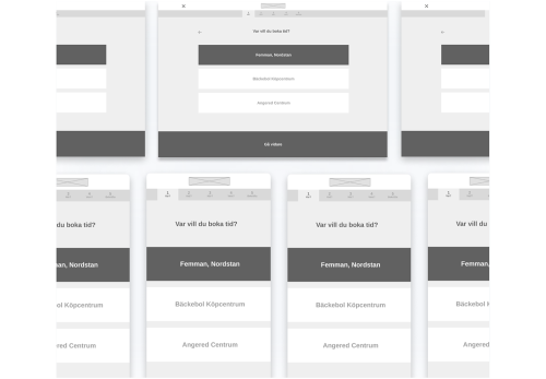
Wireframes
Wireframes were created and helped to highlight detailed issues to consider. Tests were conducted in several rounds on the booking flow which helped us take a more customer-centric design decisions. The “ next “ button that was removed is one example of improving according to the user.