UX App Design
Mooringo is a digital service that simplifies mooring for boaters and supports harbor management. Originally designed as an ”Airbnb for boaters,” the app evolved to serve harbors as well—offering real-time mooring status, improved communication, and local information. It bridges the gap between boaters and harbor masters, making both planning and spontaneous travel easier.
My Role
I was responsible for both print and digital design.
I worked on the app interface, the website, and created exhibition materials, including the visual concept for the trade show booth. I also contributed to user research and early product decisions, collaborating closely with the developers, CEO, and marketing team.
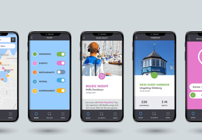
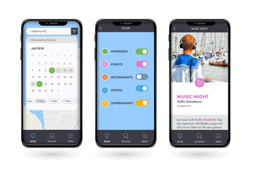
The app improved communication between boaters and harbor masters, providing real-time updates on mooring availability. The interface made it easy for users to mark their mooring as vacant or booked, and features like nearby services added practical value. The service was well received at boating fairs, where the printed materials, website, and exhibition booth helped clearly communicate the concept and attract interest.
Mobile First UI
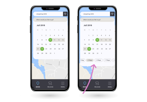
A key part of the Mooringo prototype was enabling boaters to book a mooring quickly and intuitively. Early user testing revealed a major pain point, users struggled to find available moorings because searches were limited to a single day.
I raised this issue with both the developer and the product owner, and together we reviewed user feedback alongside technical constraints. By listening closely to different perspectives and keeping the discussion open, we were able to move from problem to solution.
I proposed introducing a date-range selection, inspired by patterns used in services like Airbnb. Together, we adapted the idea to fit the existing system, aligning design, technology, and product goals. The result was a clearer overview of availability and a smoother booking flow.
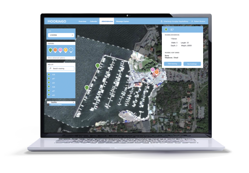
Harbours system connected to App
User interviews and behavior mapping revealed that boaters typically do not own their moorings, these are managed by harbors. This insight led to a major pivot in the app’s direction: from peer-to-peer sharing to a more integrated tool supporting harbor infrastructure. Boaters needed a way to temporarily release their mooring and find new ones; harbor masters needed accurate, up-to-date availability data.
Visual Identity
Mooringo’s visual identity combines a nautical foundation with a playful and youthful twist. While the base uses familiar marine tones like blue, the addition of fresh greens, coral pinks, and sunny yellows creates an open, friendly feeling that sets the brand apart from more traditional harbor aesthetics. The color palette reflects a modern take on boating—welcoming a new generation of boaters while remaining functional and readable in outdoor environments. The design is approachable, energetic, and easy to recognize—just like the app’s purpose